 |
 |
||||||||
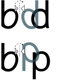 |
Read Regular is designed with an individual approach for each of the individual characters, creating difference in the actual characters of b & d itself (not mirroring the b to make the d), to create a large character differentiation. The character shapes are simple and clear, creating consistency. The characters have been stripped down from all unnecessary details –such as a two storey a and a two eyed g. >> |
|||
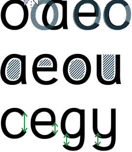 |
The individual approach creates striking outlines that make sure that each character stands on its own and works together with its previous or next character. Used in the content of words, sentences and text, the following or the previous character does not try to interfere in its readability process. Ascenders (bdfhkl) and descenders (gjpqy) are long to ensure their legibility. Inner shapes for example within the o, e, a, u and openings in e and g are kept open to prevent from visually closing in. This makes Read Regular a friendly character and a pleasant balance between black and white. << | |||
| Read Regular™ is a trademark in combination
with a European Community Design Registration for Read Regular; Read smallcaps; Read Space. No part of this site may be reproduced, stored in any form, electronically, mechanically, by photocopying, recording or any other way without written permission from Natascha Frensch. Copyright © Natascha Frensch 2003 ALL RIGHTS RESERVED. Illustrations copyright © Barbara Termorshuizen 2003 |
||